Industry News
Unveiling the Artistic Expression Behind Billboard Typography

Outdoor billboard typography is a captivating blend of art and communication that dominates the landscape of advertising. With its bold and eye-catching nature, billboard typography plays a pivotal role in capturing the attention of passersby and conveying messages effectively. Combining visual elements with carefully chosen fonts, colors, and design techniques, this form of typography holds immense potential to leave a lasting impression on the viewer. Let's delve deeper into the world of outdoor billboard typography.
The Impact of Typography on Advertising
Typography is a key element in advertising as it has the power to influence consumer behavior. When it comes to outdoor billboards, the impact is even more significant. The large format and high visibility of billboards demand typography that is easily legible and instantly recognizable from a distance. Creative typography choices can evoke emotions, establish brand identity, and inspire action. Whether it's a catchy headline or a call-to-action message, billboard typography has the ability to leave a lasting impression and generate interest among potential customers.
The Key Elements of Effective Billboard Typography
Creating effective billboard typography involves a careful consideration of several key elements:
- Font Selection: Choosing the right font is crucial in ensuring the legibility and impact of the message. Sans-serif fonts are often preferred for their clean and easily readable appearance.
- Color Combinations: The color palette used in billboard typography should be attention-grabbing and harmonious. Contrast is essential to ensure readability, but too many colors can be distracting.
- Message Length: Billboard messages need to be concise and to the point. The use of strong and impactful words, combined with a limited amount of text, is more likely to resonate with the audience.
- Hierarchy and Layout: Billboard typography should guide the viewer's eye from the most important information to supporting details. Proper hierarchy and layout techniques help in creating a visually pleasing and organized composition.
- Imagery and Graphics: Incorporating visuals can enhance the impact of billboard typography. Images and graphics should complement the typography and work together to convey the intended message.
The Evolution of Billboard Typography
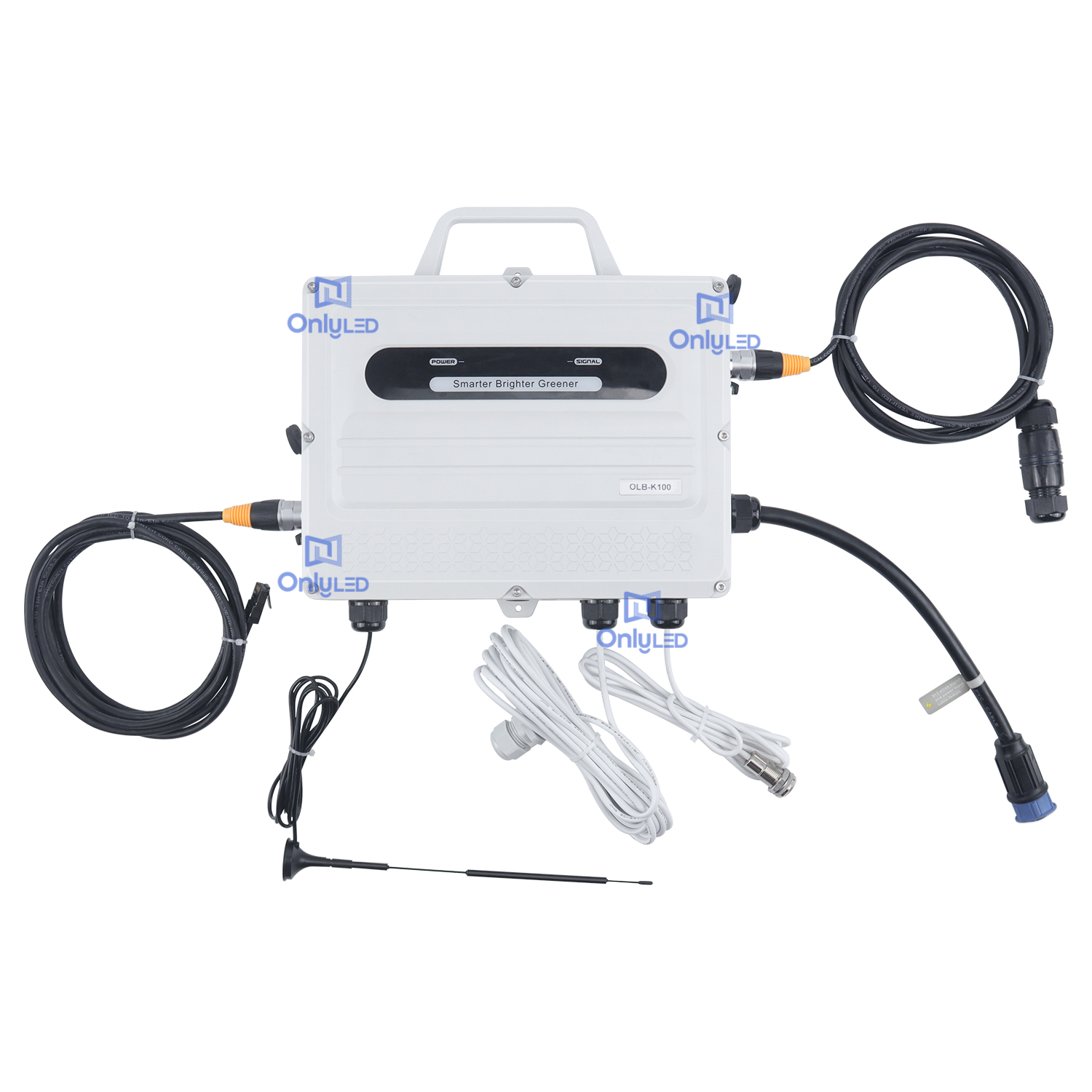
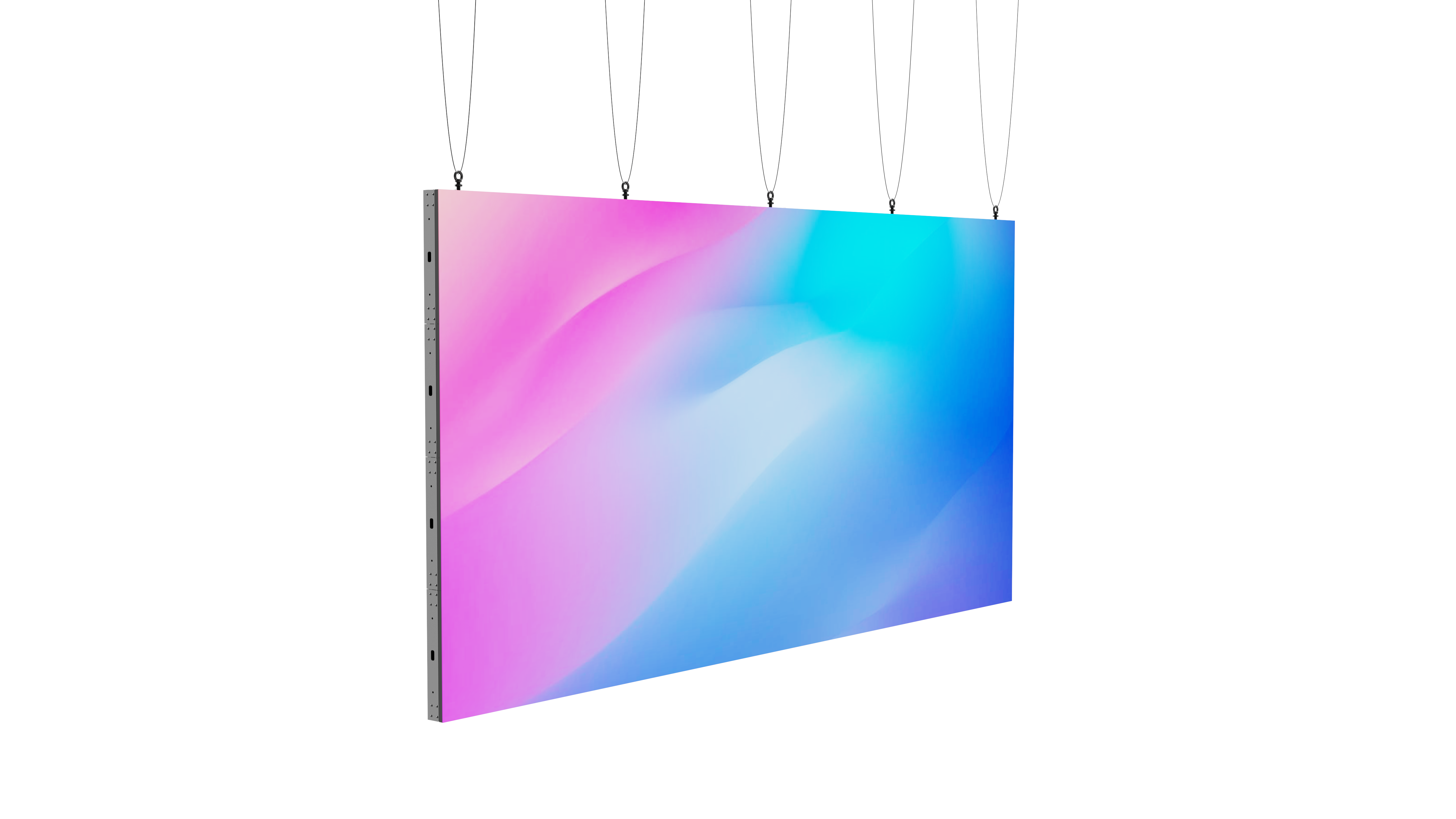
Over the years, billboard typography has evolved alongside technological advancements and design trends. Traditional hand-painted billboards have given way to digital displays and advanced printing techniques. This shift has allowed for greater flexibility and creativity in typography design. Modern billboards often feature dynamic typography, with moving elements and interactive features. Additionally, the integration of digital technology enables real-time content updates and personalized messaging. The evolution of billboard typography continues to shape the advertising landscape.
Conclusion
Outdoor billboard typography serves as an influential medium to engage and communicate with the masses. Its strategic use of fonts, colors, and design elements has the power to create memorable experiences and drive desired actions. Whether it's a captivating message or an exquisite artistic display, billboard typography continues to captivate our attention and shape the world of advertising.